Wednesday, May 22, 2013

Drum Post– The Aussie Dollar goes down and up and… ?

My Drum piece this week looked at the exchange rate and how it really is a bugger of a thing to predict – especially when you try and apply economic principles to it.

Given it has only got 64 comments, I’m guessing the exchange rate is not the most fiery of issues to debate. Ahh well. When I was studying economics at uni back during the 1990s recession one of my favourite subjects was “International Trade and Finance”, mostly I think because the textbook we used had a chapter titled “Offshore Banking and International Money Laundering”. Who says you don’t learn anything practical at uni? Perhaps I should have written about that…

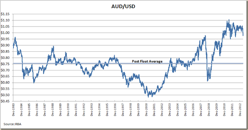
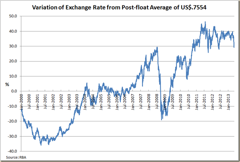
Anyhoo the dollar does bizarre things. Since the float of the dollar the average value has been US$0.7554, but during this century other than the 12 months of 2005 it has either been well below it (great for exporters) or since 2007 for the most part well above it (great for people who like buying imported things) and significantly above it since the end of 2010.

image

And going back to the start of the float the picture is this:

image

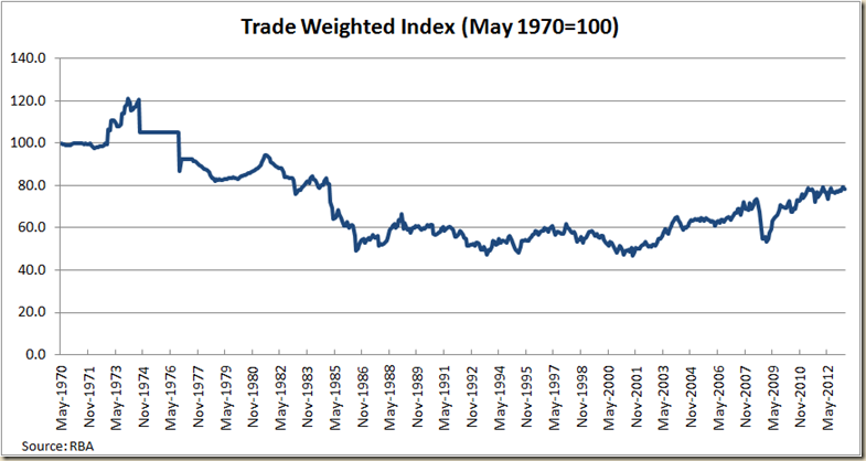
But of course we don’t only trade with the US, so we can look at the Trade Weighted Index. Since the float it had average 60.9, and currently it sits at 74.9.But if we go back before the float and look at the TWI since 1970 a different picture emerges:

image

The average back to 1970 is 71.8.

During 1973-74 the Aussie dollar was actually worth US$1.4875. Such a rate now would pretty much kill the economy (and certainly didn’t help it back then).

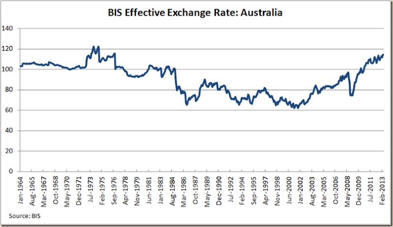
But while the TWI is one version of an effective exchange rate, the Bank of International Settlements does it's own version, and it goes back to 1964. On its measure, the Australian dollar is almost as high as it has ever been:

image

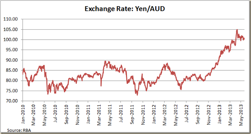
Anyway, at this level it starts getting a bit academic. The general consensus is the dollar is too high, but it’ll probably take the rest of the world to get back in shape before it starts going down – and even then, it depends how the rest of the world goes about doing it. If opther coutnires follow the “Abenomics” line of Japan we’ll stay high for a while:

image

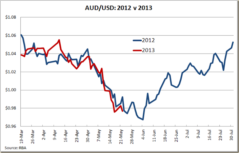
And the updated graph of 2012 versus 2013 shows the spooky similarity still occurs. We wait for Ben Bernanke to give us his tea leaves tonight…

image

Thursday, May 9, 2013

Unemployment Rate: State v State (Or don’t be a woman in QLD)

As we move into State of Origin season let’s check out the employment situation on a state by state basis.

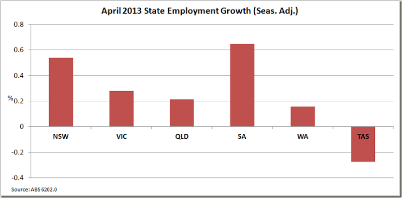
First let’s check out the employment growth in April in seasonally adjusted terms. It’s always a bit iffy to look at state unemployment this way but it’s fun nonetheless.

image

So class what did we learn?

If not much is your answer, you got straight to the honour board. Sure South Australia might be the boom state in Australia, but I think it unlikely.

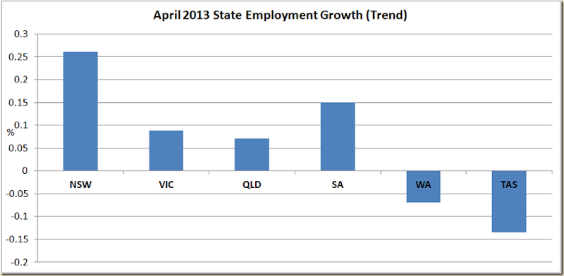
So let;s go to the trend rate:

image

So how much do we know now?

If you said, just enough to be dangerous, then you get an A.

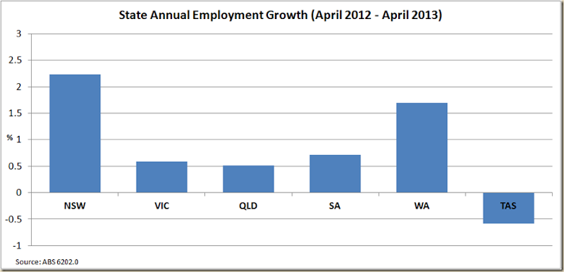
Yes WA is declining. There is a softening in the mining industry, but let’s not start suggesting it’s almost on a par with Tasmania, instead let’s have a look at the annual employment growth:

image

NSW has certainly be doing the best out of the eastern seaboard states, and WA has dropped a bit of late, but the past year has still been ok, but that 12 months rather hides what has happened this year.

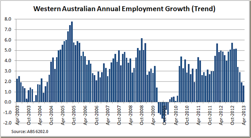
Let’s just look at WA’s annual employment growth over the past 10 years:

image

Now sure the labour force in WA is growing, but as we can see, there clearly has been a decline in the growth in the past 4 months. Indeed annual employment growth is now lower than it has been since before the mining boom (not including the GFC).

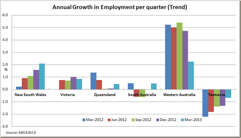
To also show just how much WA has come back to the pack, here’s a break down of annual employment growth in each state on a quarterly basis:

image

It doesn’t bode very well for the March quarter GDP figures.

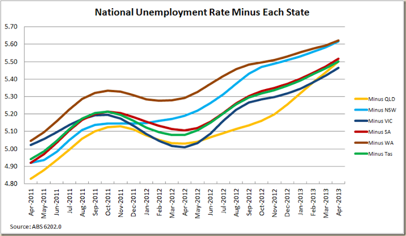
OK, now let’s look at the national unemployment rate minus each state:

image

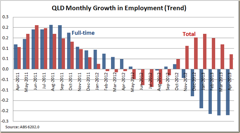
The big winner over the past 5 months on this scale looks to have been Queensland which has lifted itself off the basement. But there’s an interesting thing about Queensland’s employment growth – it’s been all Part Time.

A look at the monthly growth in employment over the past 2 years shows a pretty stark divergence from total employment growth and full-time growth in the sunshine state:

image

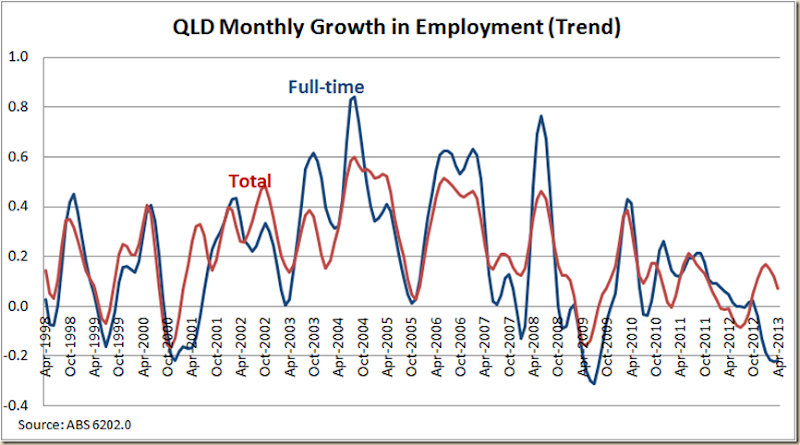
This is actually rather odd – a look at the past 15 years shows a pretty close relationship between full-time and total employment growth

image

Having full-time employment growth heading in the opposite direction to total employment growth does not look likely to persist in the long term, and given the direction total employment growth appears to be going, I’d suggest it is more likely to fall, than full-time employment is going to rise.

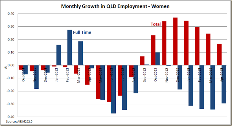
To get a real sense of what this means, let’s look at female employment in the past 18 months in QLD. We know that total women employment fell as the Newman austerity plan kicked into gear. In the past 8 months total employment for women has increased in QLD, but full-time employment has decreased. In effect those women who lost their full-time work 12 months ago have been able to get back into the work force, but only in part-time work:

image

Indeed for women, the past 12 months have actually been WORSE for seeking full-time employment than during the GFC.

It takes some doing to come up with policies that do that.

Newman’s austerity program has in effect sent women back into part-time work.

image

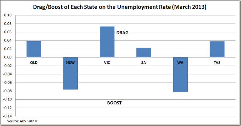
And so taking all of that into consideration, let us look at our monthly graph on which state is the biggest drag on the national unemployment rate.

image

Congratulations Victoria.

Western Australia remains the biggest boost to the unemployment rate (if a lower rate is actually a boost!), but will next month see NSW take over the top spot?

Australia's Unemployment Rate down to 5.5%

Last month when the unemployment rate rose to 5.6% I summarized it saying:

And that’ll do use for another month. Not great – 5,6% is certainly above where you’d like to be, but the trend of 5.5% at least gives us some hope that the March figures were just a bit of a blip to go along with the opposite sided blip in February.

And so it seems to be the case. Today the ABS released the monthly labour force data, showing that the seasonally adjusted unemployment rate had fallen to 5.5% and the trend rate stayed flat at 5.5%.

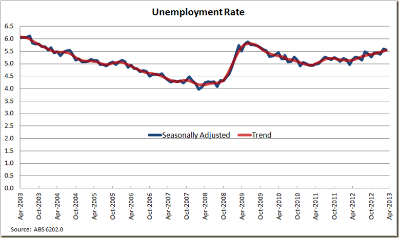
Here’s the big 10 year picture:

image

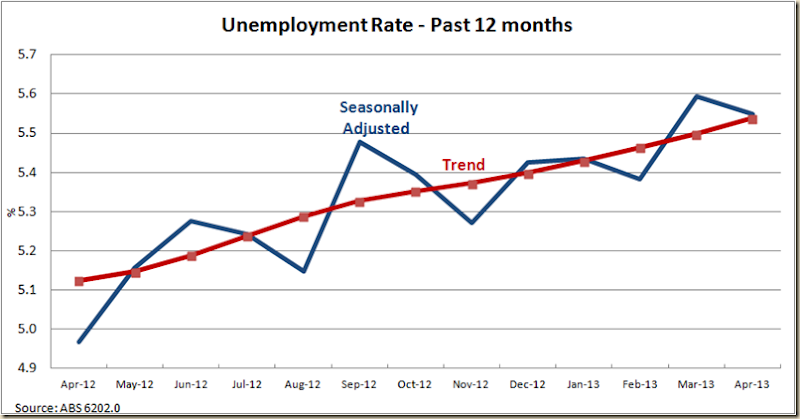
It certainly does suggest a steady increase since early 2011. But let;s go in for a closer look at the past 12 months:

image

Again, while the trend rate has been steady at 5.5% for the past three months, it has within that amount been slightly increasing.

Let’s have a squiz at why the rate went down by looking at employment growth:

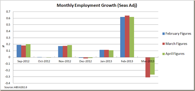
We saw a rather big spike in employment in April – a growth of 0.43%

image

Now there is often a bit of scepticism when there is a big jump in monthly figures. When the February figures came out there was a great deal of head shaking when it showed that employment had grown by 0.618% – the biggest for a decade. Last month they revised that figure up to 0.64%. This month the ABS revised it down… to 0.619%.

Indeed the past 6 months haven;t actually shown much change in the figures – certainly nothing that would suggest they got it worng in any one month and needed to massively adjust it later on.

image

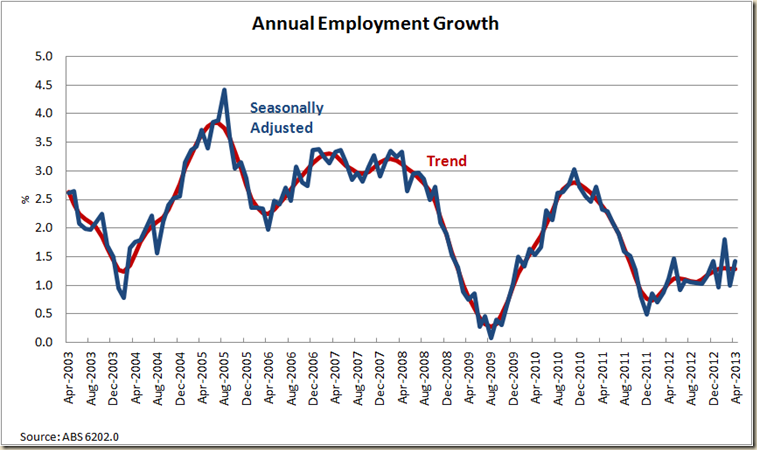
But let’s look at the annual growth in employment to get a clearer picture:

First the past 10 years for the big picture:

image

Clearly we’re not in boom time, but neither should we be as gloomy as all get out. I would note however it is now 22 months straight of annual trend employment growth below 2%. Thus getting a bit beyond the 20 months straight of such low growth from January 2001-August 2002. The average annual unemployment growth for the past 20 years has been 2.1% so the labour market certainly is below par. And you have to wonder about those who would suggest we’re about to see a big inflation breakout because of a tight labour market and low interest rates.

If we get growth back to 2.5% then I’ll get on board, but at 1.28%, let’s calm down a bit.

Indeed for some real perspective have a look at the rolling 5 yearly employment growth picture:

image

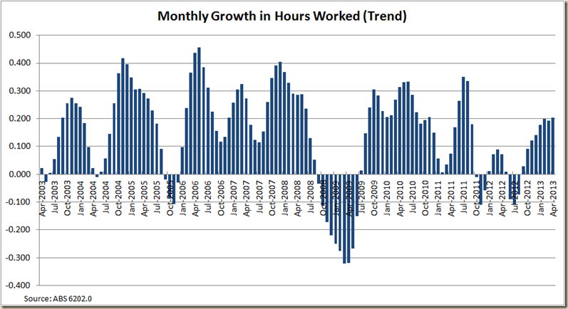
This below average level is also born out somewhat by the growth in hours worked – it’s solidly below the 0.2% mark:

image

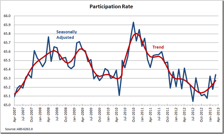
OK. Now we all know the unemployment rate is affected by the number of people looking for work, so how did the participation rate go?

image

A nice little uptick to 65.3%. Certainly not near record highs, but the direction is certainly encouraging.

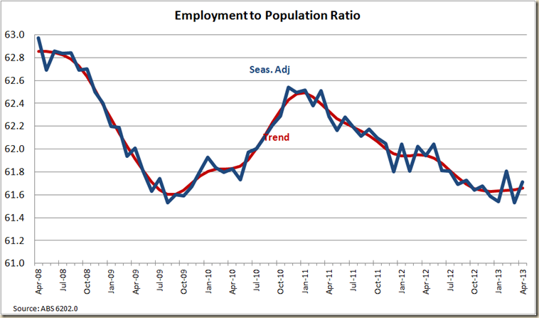
On that aspect let’s look at the employment to population ratio:

image

It saw a slight rise in trend terms from 61.6 to 61.7.

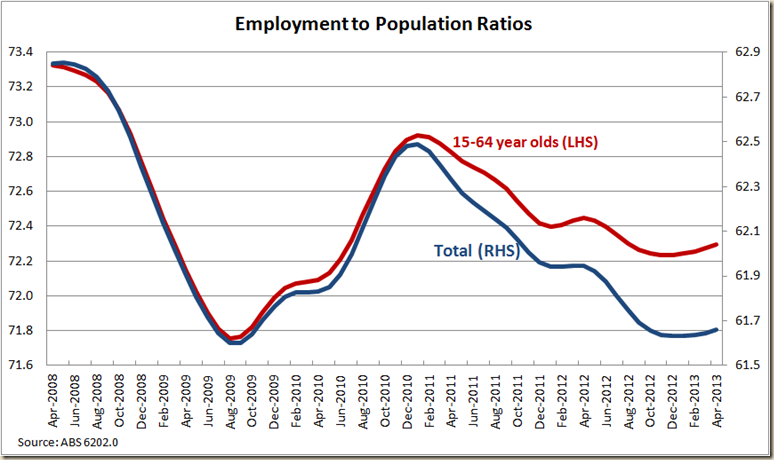
But of interest is to compare the total employment to population ratio with that of the employment to population ratio of 15-54 year olds

image

What we can see is that the rate of increase and decline among both the working age segment of the population and the total which includes people over the age of 64 was pretty similar from 2008 till the end of 2010. But since the star of 2011 the percentage of people over the age of 15 employed has fallen much more dramatically than has the percentage of those between 15-64 year of age.

Now it might just be a massive coincidence but the baby boomers born in 1946 (ie the first year of the post WWII boom) turned 65 in 2011. And thus we see the impact of the ageing of the population. The percentage of those between 15-64 working is below pre-GFC levels – suggesting that we’re a fair ways from that tight labour market, but we’re perhaps not as bad at the total figure would suggest.

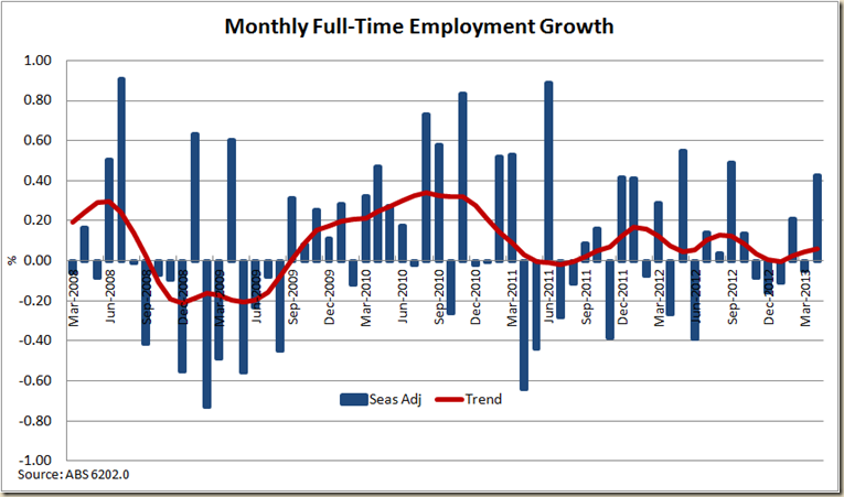
OK Let’s look at the job growth itself. How did Full-time employment go?

There was a nice jump – just touch over 0.4%

image

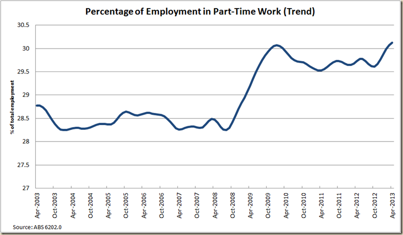
But Part Time employment is also growing and in trend terms there is now a greater percentage of the work force in part-time work than ever before. 30.1% of those employed are doing part-time work.

image

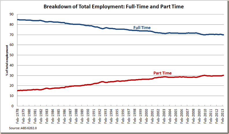
It looks like a big jump during the GFC – and it is mostly due to full-time work being converted to part time, rather than suddenly a whole of lot part-time work coming into the market, but it is part of a very long trend:

image

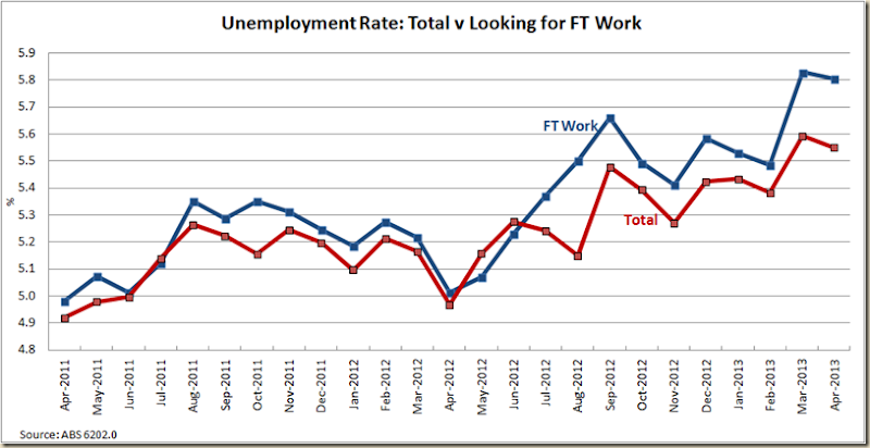
What has also happened is the unemployment rate of those looking for full-time work has remained flat while the national rate went down that 0.1 percentage point

image

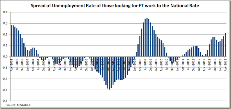
In trend terms you can see the difference between the two rates suggests again there is little “tight” about this labour market:

image

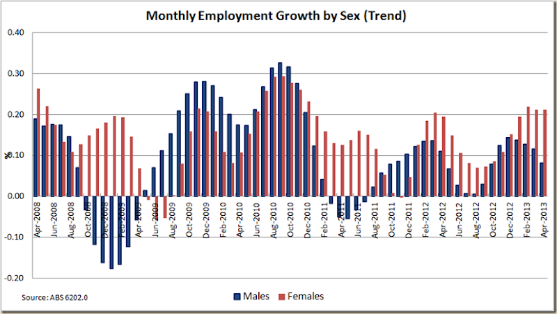
OK, now to men and women. Who is doing better in the labour market?

Well in trend terms, definitely women:

image

Anyhoo. That will do for the national rate.

It’s an improvement, but let’s not get carried away.

I’ll have a squiz at the states later.

Wednesday, May 8, 2013

Drum Post–Dodgy Graphs and Easy Markers

My Drum post today looks at some of the pretty misleading graphs being used on political parties websites.

I suggest that when you start seeing these graphs you really need to put on your sceptical hat because there’s often a fair bit of trickery going on.

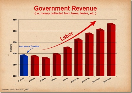
Rather surprisingly, over on Catallaxy, Sinclair Davidson has had a very little crack at me for finding fault with this graph by the Libs:

563628_10151612767612464_313054714_n

He thinks it “does a good job at dispelling the lie that the government has less money coming in”.

Which would be fine except that graph does not really just do that. By showing only one year of the LNP govt and then extending out to the end of the forward estimates the graph is clearly attempting to suggest there has been a boom in tax under the ALP.

And just to show how dodgy the graph use is, the Libs have come up with a new version today:

941115_10151643229602464_645709419_n

Wow see that exponential upswing! And there’s an even added new bit of joy to discover! According to this graph tax revenue was actually lower (see that downward blue arrow) in 2007-08 than it was in 2008-09. Astonishingly $294.9 billion is now LESS than $292.6 billion!! Gotta love budget finance done the Liberal Party way.

I have no problems with someone stating that nominal revenue (or even real revenue) has gone up under the ALP – hell I wrote a Drum post about it last week! But let’s not be so gullible as to think the Liberal Party (or ALP) are pitching their graphs on Facebook to economics professors. They’re pitching it to people who would be utterly bored with economics and anything to do with the budget. But when they see a graph like those above they are lulled into thinking – geez the ALP has gone off on a taxing hike after the low taxing Liberal Party lost office.

Sinclair I think is being far, far too generous about the Liberal Party’s intentions. A bit like a teacher who knows a student has got something wrong, but because he likes the student he marks the essay on the basis of what he believes they were really trying to say, rather than what they did.

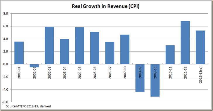
Personally I’m not so easily accepting of such a story, especially when you look at the increase in real revenue since 2000-01

 image

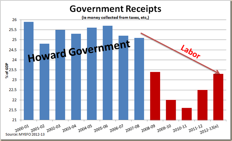
As I noted in my Drum piece last week when I looked at revenue I used % of GDP. But I didn’t suggest a graph like this was the way to do it (which is my version of the Lib’s Facebook graph):

image

Instead I used this graph:

image

I think my graph is a pretty honest view of how things are. And I even posted this graph as well just to show I’m not locked in on only % of GDP terms:

image

I called out Julia Gillard for suggesting revenue has fallen, but I’ll also call out the Libs for suggesting revenue is zooming faster than what it has in the past.

The political party’s are engaged in spin. I don’t think it helps the debate much if we give them a free ride and even a pat on the back for doing so.

Tuesday, May 7, 2013

RBA drops cash rate to 2.75% (or How do you like those record lows?)

In a move which I didn’t see coming, the RBA today cut the cash rate by 25 basis points to 2.75%.
image

It came on the back of poor economic data such as today’s goods and services trade data which showed there was a pretty steep fall in import of capital goods – 21.7% in the past year which is the biggest drop since 2009.

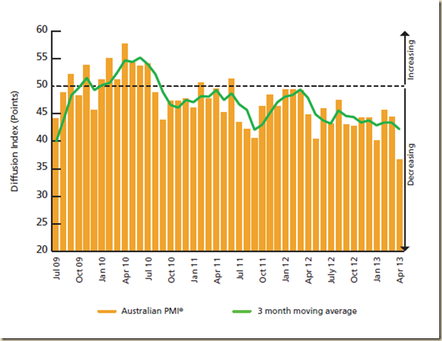
Clearly as well manufacturing has been struggling  - notably seen by the rather awful AiG Performance Managers Index result in April fall 7.7 points to 36.7 – a long way below the 50 point mark which indicates production is steady:
www.markiteconomics.com-Survey-PressRelease.mvc-c3d2dd3a9b9e42c2b2bf0e00181703b1

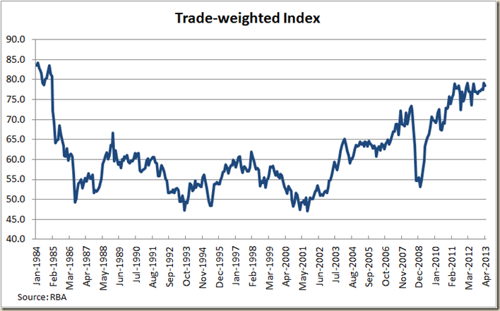
The big problem form manufacturing is of course the Aussie dollar. Despite having previously rock bottom rates, the dollar remain stuck above parity with the US, and at near post-float record highs on the Trade Weighted Index:
image

In the RBA’s eyes, it needed to do something, and the biggest thing it can do is lower the cash rate.

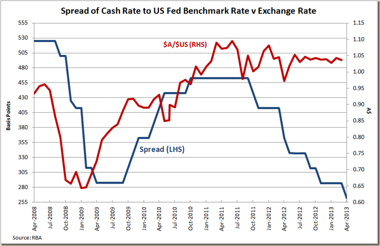
The problem of course is that while America’s employment situation is starting to improve, its equivalent rate set by the Federal Reserve (the benchmark rate) remains stuck on 0.13% (where it has been since December 2008).

And rather annoying while the RBA has been cutting the cash rate, it hasn’t done anything to bring down the value of the dollar, despite this cut reducing the spread between our cash rate and the USA’s benchmark rate.
image

Essentially it seems it is not enough for our rates to go down to stop traders liking our dollar compared to the American, the yanks need to start doing some lifting as well.

But today see the RBA alerting the market that its prepared to work to get the value of the dollar down.

The difference can be seen in the statement issued today compared to last month.

Last month on the exchange rate, the Governor’s statement noted its stubbornness within a general paragraph about monetary policy:

There are a number of indications that the substantial easing of monetary policy during late 2011 and 2012 is having an expansionary effect on the economy. Further such effects can be expected to emerge over time. On the other hand, the exchange rate, which has risen recently, remains higher than might have been expected, given the observed decline in export prices. The demand for credit has also remained low thus far, as some households and firms continue to seek lower debt levels.

This month the exchange rate led its paragraph:

The exchange rate, on the other hand, has been little changed at a historically high level over the past 18 months, which is unusual given the decline in export prices and interest rates during that time. Moreover, the demand for credit remains, at this point, relatively subdued.

The subtle (or unsubtle if you spend time pondering the tea leaves of central banker's words) change from “higher than might be expected” to “which is unusual” pretty much suggests the RBA doesn’t think this is an anomaly that is going to sort itself out through normal market conditions.

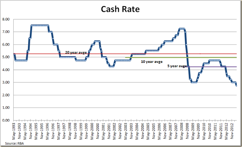
But we have to realise as well that “normal” is a bit of a misnomer when we look at current monetary policy. The average of the cash rate for the past 5 years is now 4.23% – how low is that? Well back in 2004 when John Howard was boasting of record lows the cash rate was 4.25%, and it stayed at that rate for a mere 5 months before going back up.

So the monetary picture has changed not just a little but a lot. The 20 year average cash rate is now 251 basis points higher than the current rate.

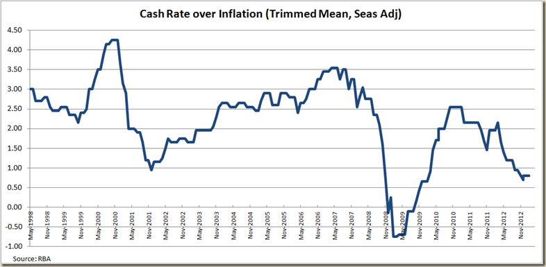
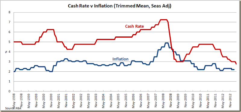
Compare as well the cash rate to inflation”
image

Other than during the GFC, when the RBA cut rates ahead of drops in inflation, the only time we’ve had the cash rate this close to the inflation rate was back in 2001 in response to the Asian financial crisis. Back then when the real cash rate was 0.95 (ie the nominal cash rate was 95 basis points above inflation) the nominal cash rate was at 4.25% – a whole 150 basis points higher than now and the inflation rate was at 3.3% – compared to the latest rate of 2.2%.
image

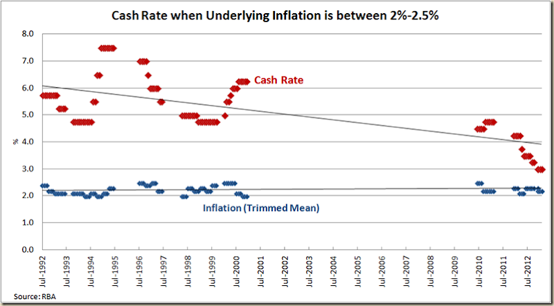
Thus we are now in a position where the cash rate and the inflation rate are lower than at previous times when the RBA needed to run a similar expansionary monetary policy.

I noted this last year when I looked at the different level of the cash rate when underlying inflation is between 2-2.5%.
image

Times have changed. Normal is different to the old normal.

There’s not a hell of a lot of room for the RBA to move now. It can’t drop rate much more before it starts hitting the inflation rate. So in terms of stimulatory effects to the economy, most of the result from this rate will be through the secondary impact of the exchange rate declining.

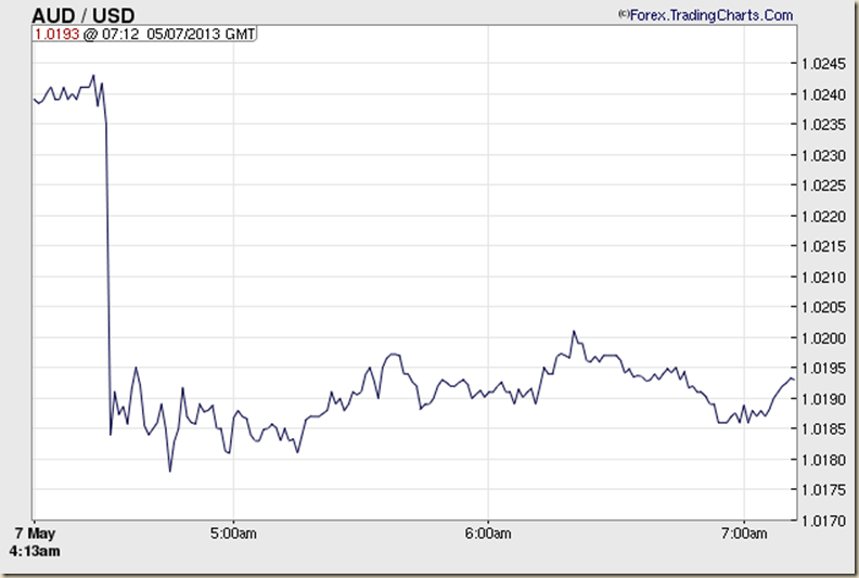
Will it? Well the very early indications are good (note the times are GMT):
AUDUSD Chart 2 (Australian Dollar - US Dollar Forex Chart)

But that reflects more the market being taken by surprise. We shall have to wait to see if this drop in the cash rate finally gets the dollar heading down, or if the RBA needs to do more to let the market know it is serious about lowering the dollar – even if it means allowing inflation to rise.

And just a final thing. One of the wonderful things about the lowering of interest rates is it rather puts into sharp relief those who believe that Government debt causes interest rates to go up. As Tony Abbott said in April last year:

Everyone needs to understand that when the Government is out there borrowing $100 million every single day, there is going to be upwards pressure on interest rates.

Since then the cash rate has gone from 4.25% to 2.75%. The average mortgage rate has gone from 7.4% to around 6.2% (the lowest they’ve been for 10 years). Don’t you hate it when the economy turns out to be more complex than a sound bite?

I was just made aware that this morning on AM, Barnaby Joyce said this about the high dollar:

MARTIN CUDDIHY: The Coalition can't make it rain and you can't bring down the high Australian dollar, so how much realistically would change?

BARNABY JOYCE: …. You can not exacerbate where our dollar is by making sure that we keep down the amount of borrowing, because the higher our borrowing goes the more we have to attract funds in, the more our domestic interest rates stay high, the more our Australian dollar stays up. So you can actually affect the Australian dollar.

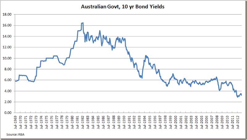
Ok then. Given the Govt borrows money by selling bonds, let’s have a look at the 10 Year Commonwealth Govt bond yield:
image

Yeah, the Govt is really having to raise rate to “attract funds”.

And yeah, I know. I know the next thing you say is “crowding out” where the Govt borrowing all this money is making it tougher for commercial lenders to raise finance. What did the RBA say about that today:

Financial conditions internationally continue to be very accommodative, with risk spreads reduced, funding conditions for most financial institutions improved and borrowing costs for well-rated corporates and sovereigns exceptionally low.

EXCEPTIONALLY LOW.
Wednesday, May 1, 2013

Drum Piece–Budget: Not all declines are declines

My Drum piece this week looked at the announcement of a $12b fall in expected revenue and the claims and counter claims about what this means about revenue and the budget.
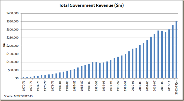
As a general rule I hate it when people start talking about total tax in nominal dollar amounts.

Usually when they do they’re trying to sell you something. Like the Liberal Party is currently with this graph it has put on its Facebook page:

563628_10151612767612464_313054714_n

Well golly gee, it looks like tax revenue was flat – if not going down when the ALP came into office and then they got greedy and up it zoomed. Terrible ALP Government all about taxing you to death.

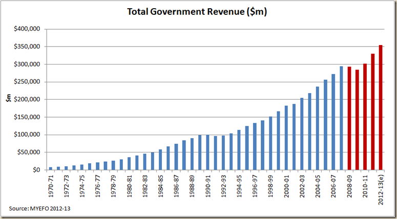
Well this is what the graph looks like if we take it back a few years:

image

Suddenly the decline in revenue in 2008-09 and 2009-10 (the only time since the Great Depression total revenue has declined two years in a row) looks a bit stark.

But as I say, total nominal dollars are mostly for propagandists.

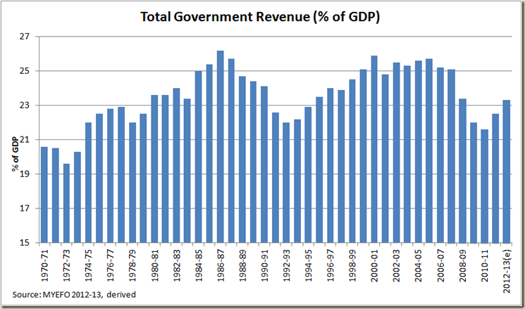
Let’s look at revenue as a share of GDP, because that takes into account inflation and the size of the economy (because inflation affects GDP as well as revenue and first the big picture:

image

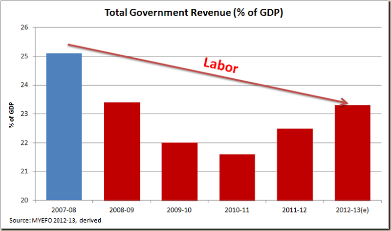
And now how it would look if we used the Liberal Party’s Facebook Advert time period (and I’ll even cut the hell out of the Y Axis to exaggerate the drop as they did to exaggerate the increase in nominal $)

image

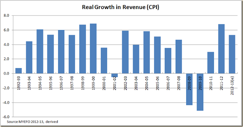
And of course the talk was all about the 7% increase in nominal revenue. But a good way to look at the increase is in real terms

image

On this measure the Government has had a good increase in revenue – in fact at 5.3% it is just below the 5.4% average increase achieved from 1993-94 to 1997-98 when the Keating/Howard Governments took the budget from a deficit of 4.1% to a balanced budget. In the past three years average real revenue has increased by 5.0% on average – and yet Wayne Swan is supposed to have brought the budget back to surplus?

I think not.

My favourite graph of the day:

image

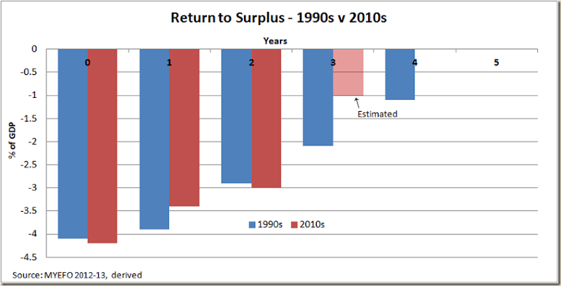
Wayne Swan was hoping to go from a deficit of 3% to zero in one year. It took Peter Costello 3 years, and the world economy was in a much much better shape than it is now.

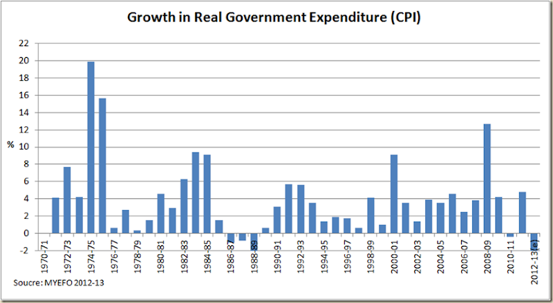
One of the things I’m most interested in seeing come Budget day is the expenditure amount for 2012-13. In the MYEFO it was projected to be 4.4% less than last year in real terms.

image

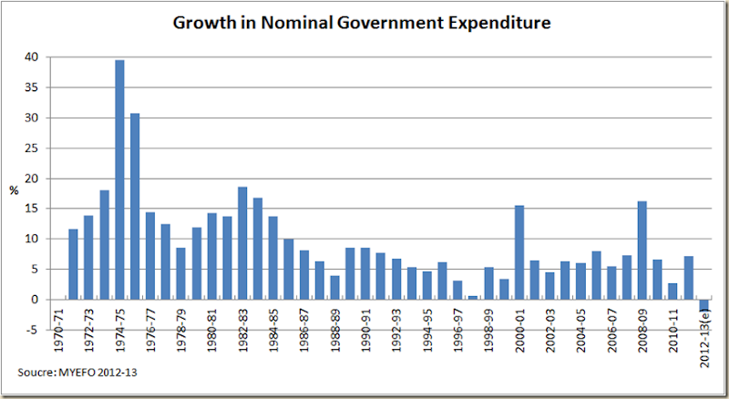
That in itself would be rather stunning, but (to go back to nominal dollar terms), the MYEFO was still predicting expenditure in 2012-13 to be actually less in nominal terms. And that has never happened in my lifetime:

image

I’m not saying it should even happen – it’s pretty bloody severe austerity, which, because of the drop in forecast revenue Swan will get absolutely no credit for. But I am interested to see if it does happen (and also if any swifty accountancy is needed to achieve it)