Thursday, December 6, 2012

Industrial Disputes–strike me pink

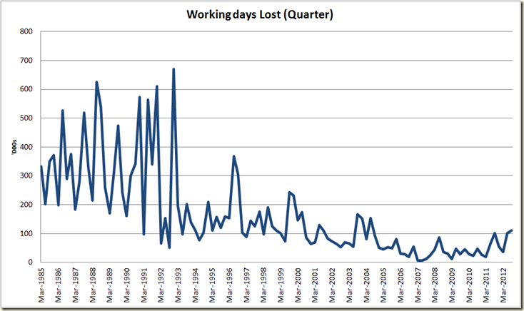
And now to round out the week’s economic data, Industrial Disputes. No doubt these’ll get a big run tomorrow in certain newspapers (a hell of a lot more than they gave the productivity figures, I’m guessing).

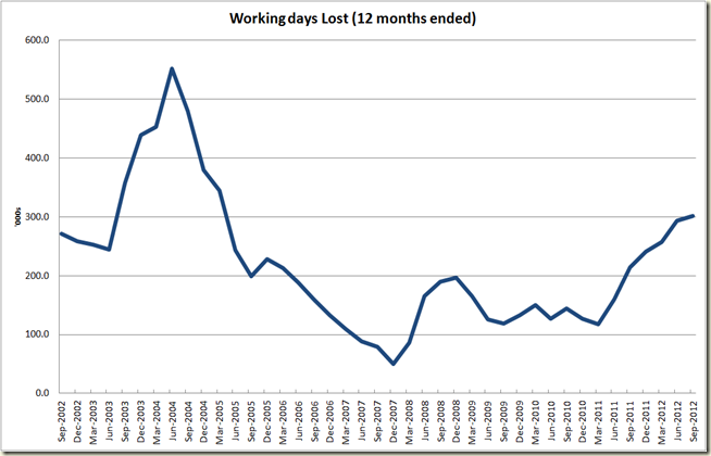
First the long term picture:

image

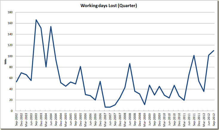
Now I know that’s not fair because it shows context, so let’s just focus on the past 10 years:

image

So yep, the September quarter saw an increase in the number of days lost to strikes.

The ABS states:

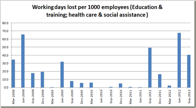
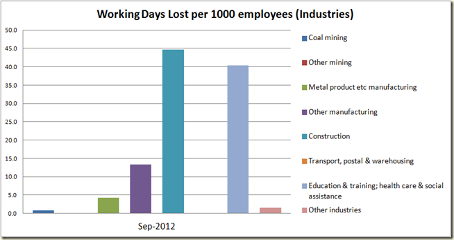
  • High numbers of working days lost were driven by large disputes in the Education and training and Health care and social assistance industries in September quarter 2012 and June quarter 2012.

And if we look at the data, we see yep:

image

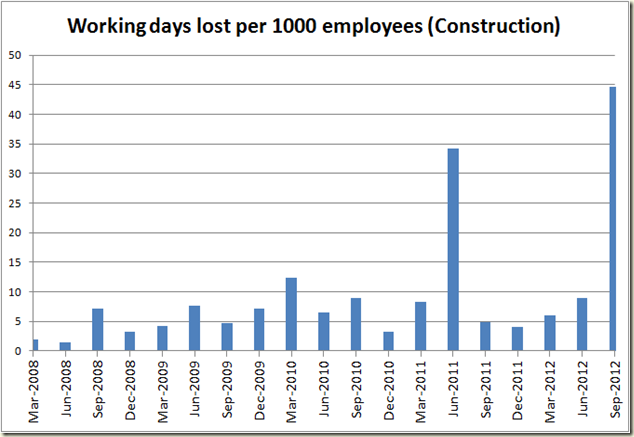
Mostly these is non-FWA related. There were also however a big jump in disputes in the construction sector. It is worth remembering the September quarter includes the Grocon strike by the CFMEU:

image

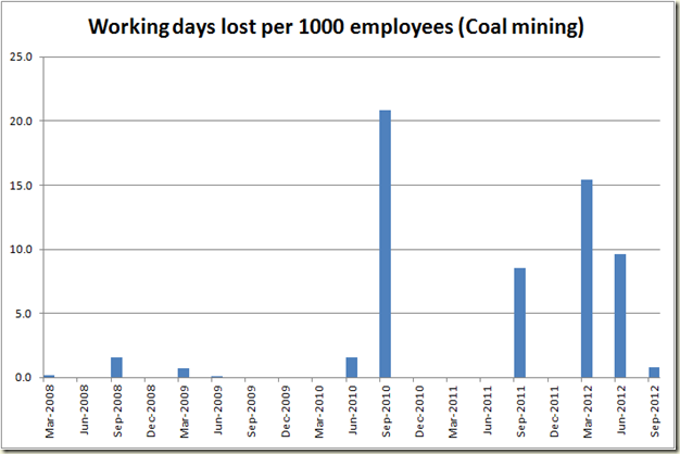
In other sectors things aren’t so strike happy, eg in coal mining there was a big drop:

image

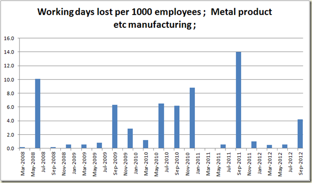
and in the manufacturing sector after 3 quarters of next to nothing there was a little spike:

 image

It’s worth noting the scalr of each of these is different, so here they are on the same chart:

image

It all washes out for an annual figure of this:

image

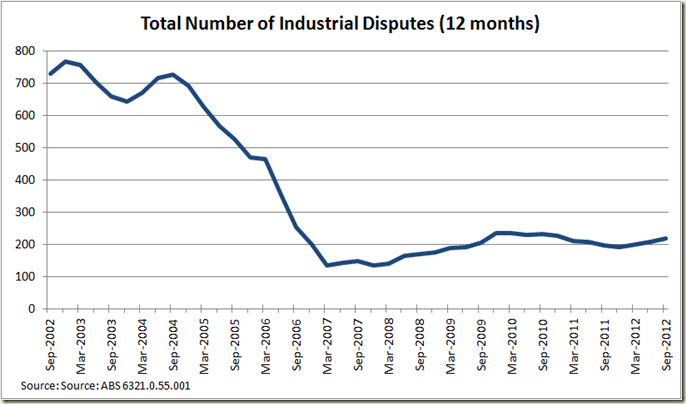
It;s worth noting that it’s not as if Australia is breaking out in strikes at every workplace. The actual number of strikes is pretty flat:

image

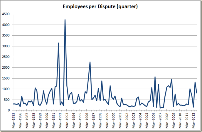
But the number of employees has risen – indicative that the strikes are involving more workers per-strike than in 2010-2011:

image

And that pretty much is that. No doubt it means the unions are rampant and there is a n industrial war being waged, because of course it is only the fault of workers that industrial disputes occur.

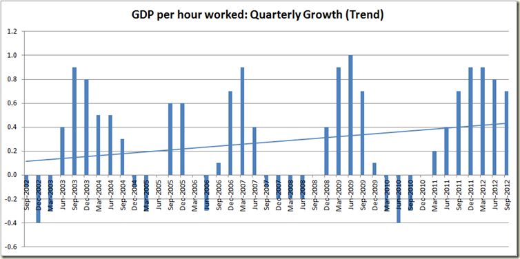
Anyhoo just remember if the problem with industrial disputes is all about productivity then here we go:

image

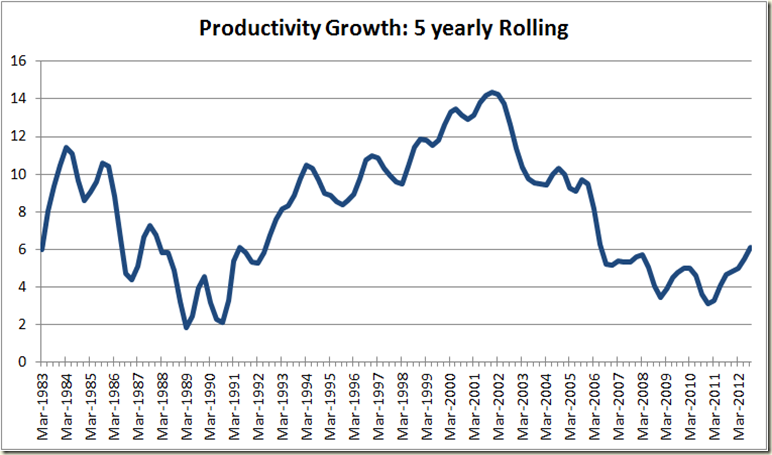
Do you see that trend line? This is the first time for 10 years we have had 7 quarters in a row of productivity growth in trend terms. But we all know that the problem with productivity is long term, so let’s look at the 5 year rolling average:

image

Look I know it’s not record breaking. I know it’s not as good as what occurred back in the 1990s when computers were being introduced into every work place, but it is now been going up, and has been for a year and a half.

Now I don’t mean to be bitter, but if such a turn around had occurred under Howard and Costello’s watch, The Oz and AFR would be demanding they be granted sainthood.

Of course this 5 year growth will likely go up in the next 18 months because the over that time the impact of the GFC will wash out of this rolling 5 year period – and because it’s not likely that we will have 5 quarters in a row of negative productivity growth, that mean the 5 year average growth will increase.

Of course if Abbott is PM by then, I’m sure certain newspapers will find a way to mention it on the front pages…
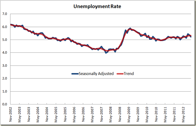
Unemployment Rate in November falls to 5.2%

Well that was unexpected!

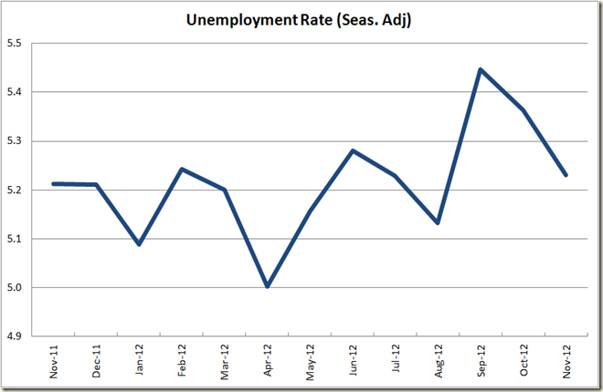
Today the ABS released the Labour Force data which showed that in seasonally adjusted terms the unemployment rate fell from 5.4% to 5.2%. The fall is quoted as being a 0.1 percentage point fall, due to rounding. The October figure was 5.3636679% and the November one is 5.2312088% so the fall was 0.1324591 percentage points. (but ignore all that – at that level of decimal points the confidence levels gets pretty poor – which is why the ABS rounds to only 1 decimal point)

In trend terms it stayed flat at 5.3%:

image

The close-up of the past year shows that we’re pretty much back where we were 12 months ago:

image

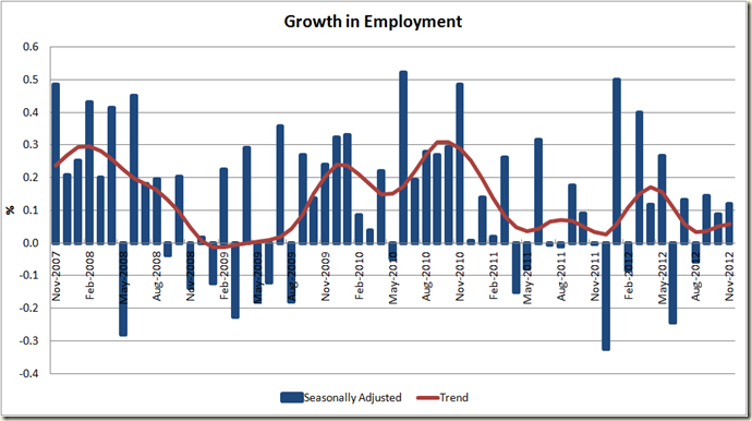
Now this is good news, but let’s go deeper and look at the employment growth. First the monthly growth:

image

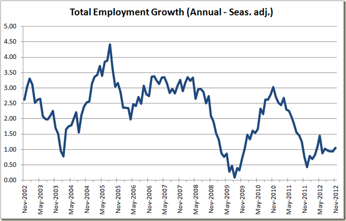
It ain’t spectacular, and is really struggling to get over 0.1%. A display of how flat the labour market is right now is best shown by a look at annual employment growth over the past 10 years:

image

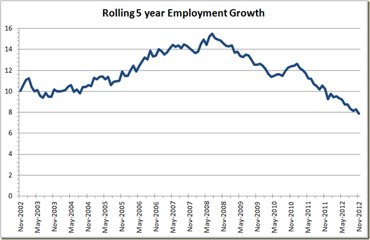
We really should be wanting growth around the 2-3% mark. There is a lot of spare capacity at the moment. Looking at the 5 year rolling growth figures also shows where we’re at with respect to Tony Abbott’s desire for a million jobs in 5 years (which needs around 8.7% growth over 5 years):

 image

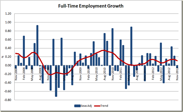
OK, but we did have job growth this month, what type of jobs? Well not full-time ones – they fell in seasonally adjusted terms by 0.05% (4,200 jobs), it was part-time work which increased – with 18,100 of those jobs:

image

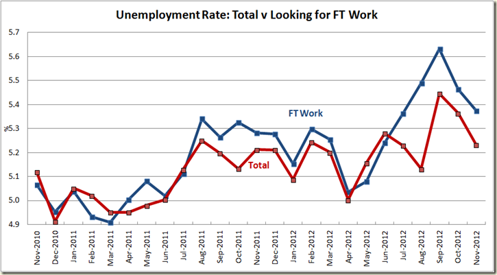
Despite this, the unemployment rate of those looking for full-time work fell:

 image

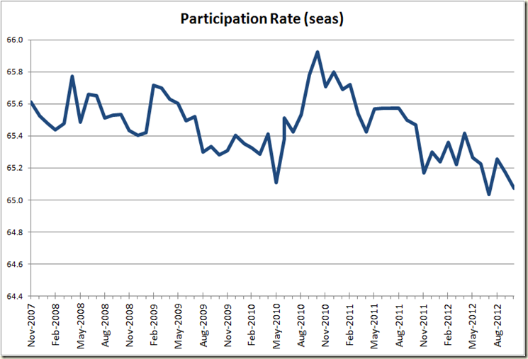
Perhaps due off the back of a 0.1 percentage point fall in the participation rate:

image

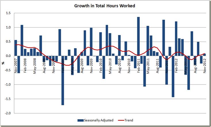
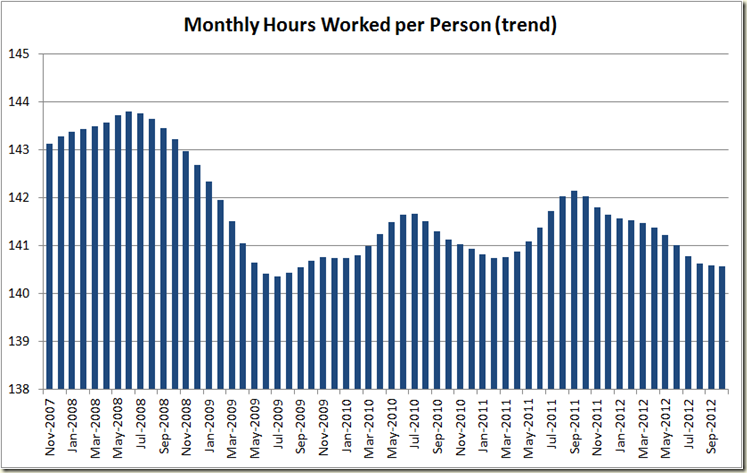
Given the mish-mash of full-time jobs declining and part-time jobs increasing, I like to look at the growth of total hours worked. Rather nicely it shows that in November there was an increase in hours worked (in both seasonal and trend terms):

image

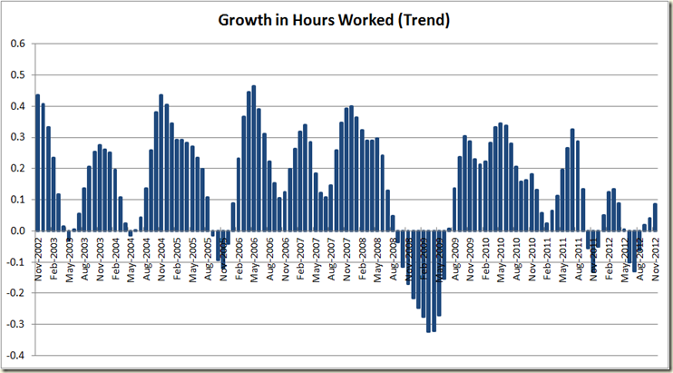
For the long term picture I think the trend rate shows it best. Yes it went up, but boy, it ain’t looking great:

image

This also saw average hours per worker remain flat:

image

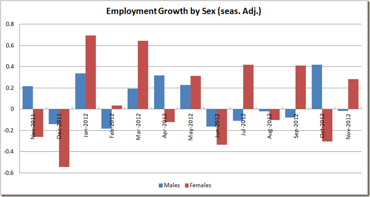
Not surprisingly the increase in part-time work and the decrease in full-time led to a decline males in employment and an increase in women working.

image

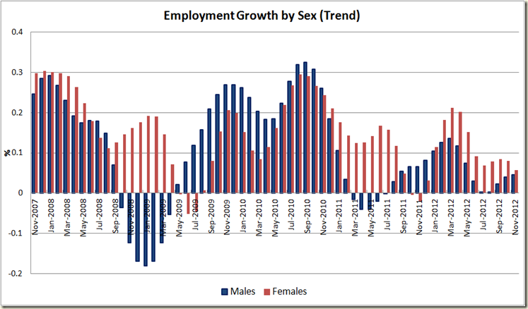
The seasonally adjusted chart is pretty much illegible when you try and look long term, so here’s the trend growth over the past 5 years – it’s worth showing for noting that the GFC was really a male unemployment problem:

image

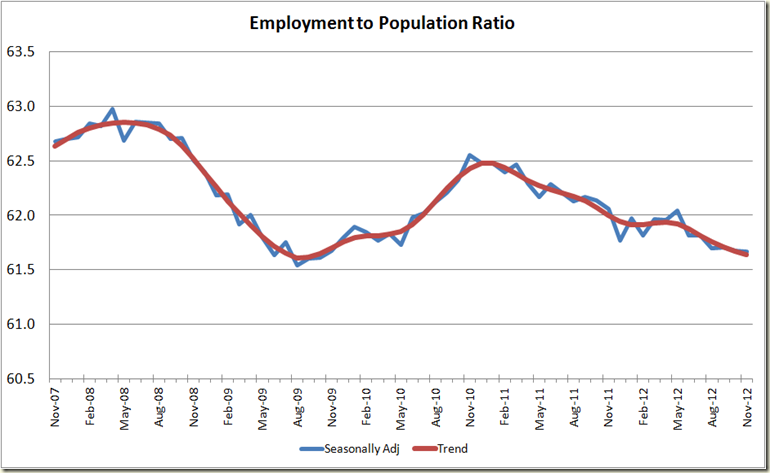
Now to every wonk’s favourite statistic – the employment to population ratio. It stayed flat at 61.7% with a drop of 0.1% in trend terms:

image

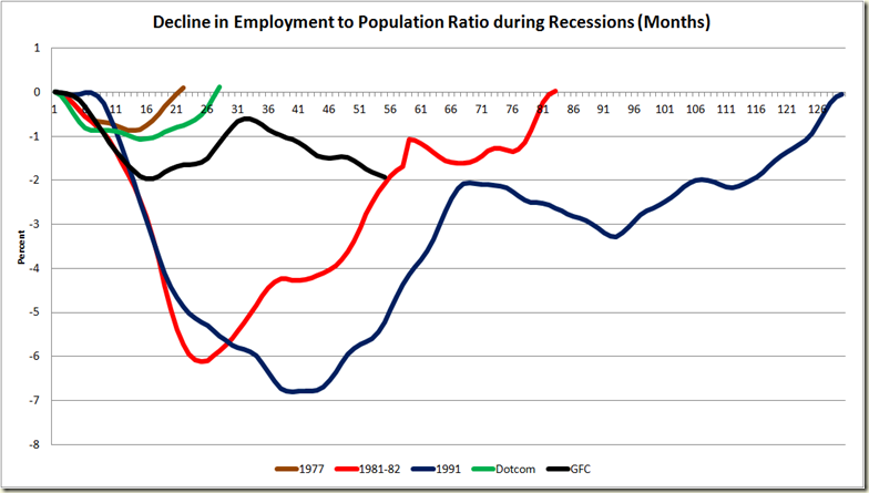
And to compare it with how we’re going with respect to other recessions: Ewww,. Don;t you hate that ageing population…
image

Now to the states:

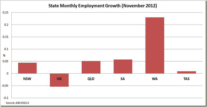
Queensland has after a stretch of going backwards again enjoyed a month of employment growth – it had a big boost in seasonally adjusted terms, though on a state level they can fly up and down a bit so let’s keep to the trend levels:

image

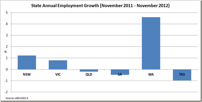
WA once again shows the way. And when we turn to the annual growth, it again leads by a mile:

image

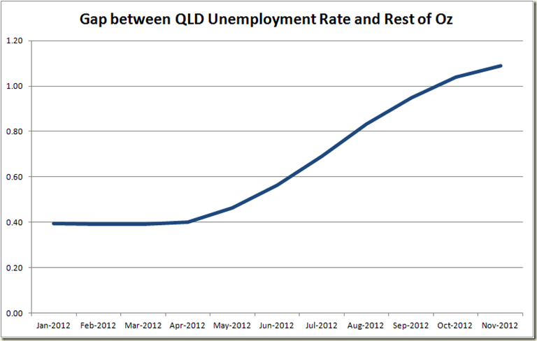
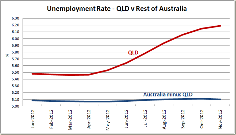
And at least you can say the gap between the unemployment rate in QLD and the rest of the nation isn’t growing as fast as it was 6 months ago…

image

As the unemployment rate of QLD v All Places in Australia not run by Campbell Newmann looks like this (last time I did the seasonally adjusted version. This time I’m using trend):

image

Good times up north!

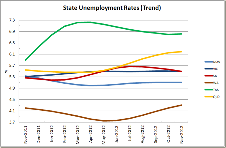
Andrew Catsaras asked about state unemployment numbers. Here’s a chart of the trend rates:

image

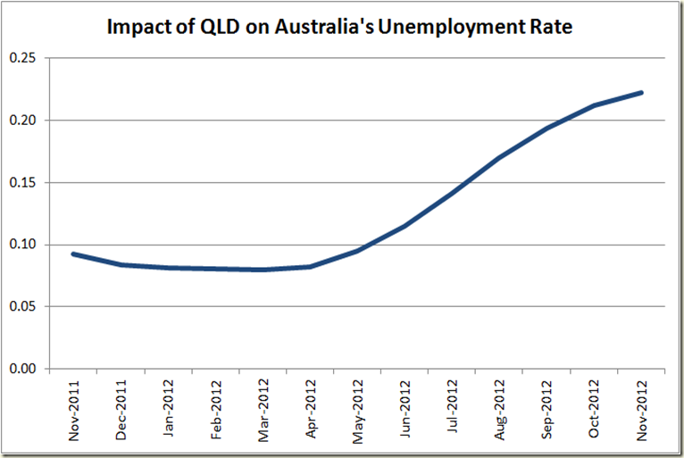
Also on Twitter Possum has a very good graph looking at the impact of QLD’s unemployment on Australia's unemployment rate. It’s nifty, so I’m flogging the idea! Essentially it is the difference between the current unemployment rate and the unemployment rate minus QLD.

image

Wednesday, December 5, 2012

Australia’s Annual GDP Growth Falls to 3.1%

And so this wonderful week of economic data hit the peak today with the national accounts being released by the ABS (labour force and industrial disputes are out tomorrow).

The September quarter figures should in seasonally adjusted terms, Real GDP rose by 0.5%, for an annual rate of 3.1%. This was a fall from the year on year rate in the June quarter of 3.8%. Those sharp thinkers among you might recall that in September when the last figures were released the year on year growth was 3.7%. The ABS revised the last few quarter a bit:


June Growth Figures

September Growth Figure

September 2011 1.128% 1.181%
December 2011 0.502% 0.695%
March 2012 1.376% 1.298%
June 2012 0.644% 0.578%

Back when the March 2012 figures initially came out there was a fair bit of hoo-ha suggesting the ABS had stuffed it all up because the March growth was 1.3% (or more specifically 1.2957%).

Tim Colebatch (who I generally think gets it right) for example wrote at the time:

THERE'S an old saying among economists: if a figure looks wrong, it usually is. Yesterday's estimate that GDP grew 1.3 per cent in the March quarter amid all the job cuts is a good example.

These figures strain credulity.

And he ended with:

Wayne Swan wants us to take pride in these figures. I would if I could believe them.

At the time I tweeted a pretty scathing assessment of his piece.

Well since then the March quarter growth figures have been revised. Last quarter they were revised up to 1.376%, and this month they were revised down to 1.298%, leaving them a whopping  0.001% different form the initial estimate.

I think we can believe them.

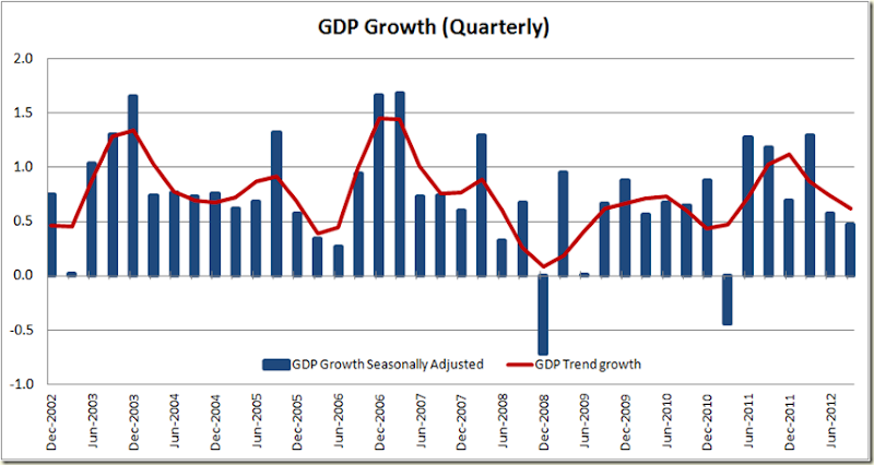
OK some graphs – here is the quarterly growth:

image

It doesn’t look all that wonderful to be honest. Take out the (very good) March figure and things are not looking that rosy. And the trend certainly gives you a sense of where things could be headed.

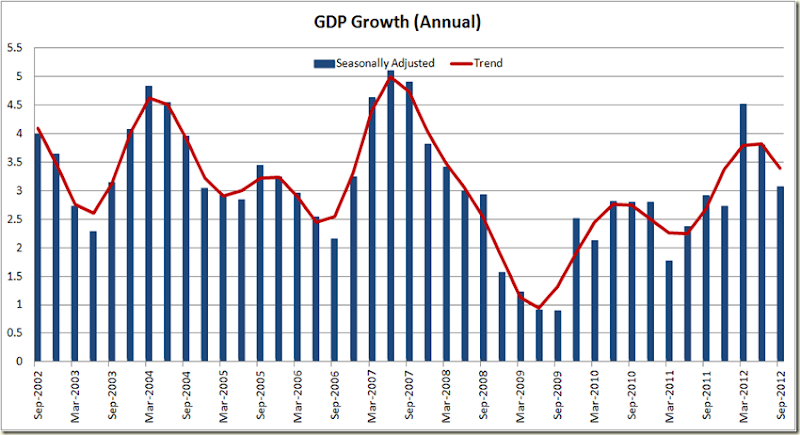
The annual growth figures say much the same:

image

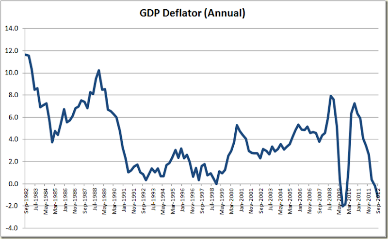
Now one very interesting thing about the figures released today is the GDP deflator. This is essentially the inflation gauge used to determine the “real GDP” – which is nominal GDP growth minus inflation . The GDP deflator shows we have been experience deflation

image

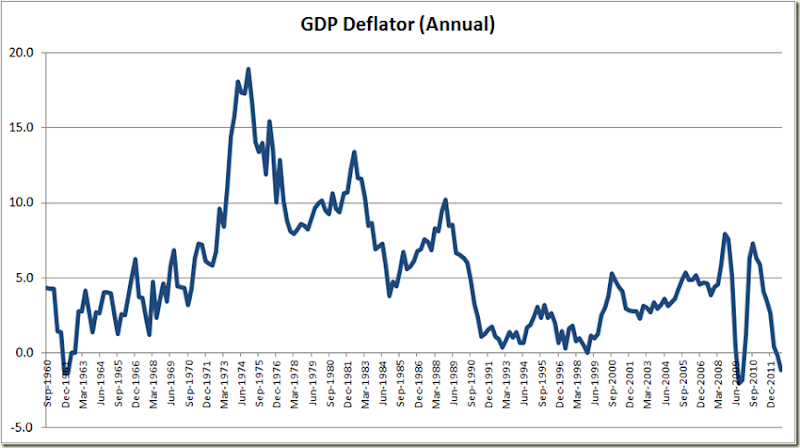
To get a sense of how unusual this is look at the annual GDP deflator all the way back to 1960:

image

Things are pretty irregular at the moment.

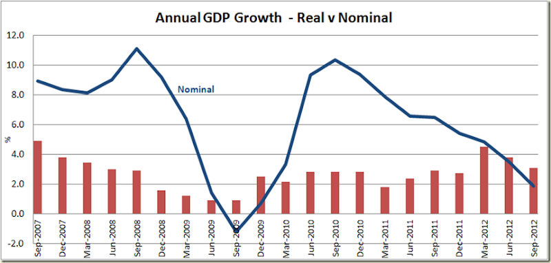
What this means is that rather oddly nominal GDP growth is actually below real GDP growth:

image

This is not actually a good thing. Sure we love low inflation, but deflation? That ain’t a sign that things are healthy.

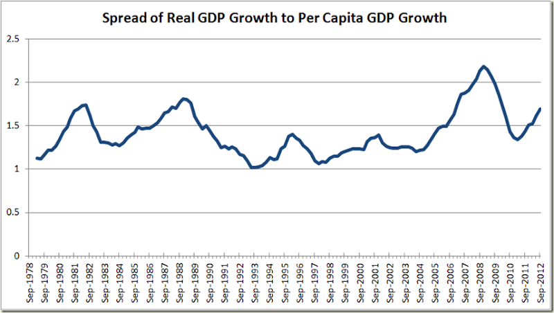
Similarly let’s compare GDP growth to GDP per capita growth. What you see is that during the GFC Real GDP (which ignores growth in population) grew more (or fell less) than did GDP per capita growth. After falling back to near average levels in 2011 once again it is increasing – a sign that the economy might be doing OK, but it is not really being felt across the nation.

image

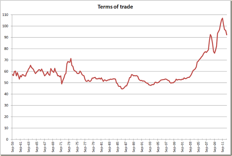
The quarterly growth of 0.5% is being talked down as a bit of a disappointment. Personally I was relieved – I thought it could be less given how crappy things were in that September quarter. The Terms of Trade for example were really bad, falling 4.0% for a 13.7% fall in the past 12 months. For a country that loves making money from mining, that makes it hard to keep growing:

image

OK, now to productivity.

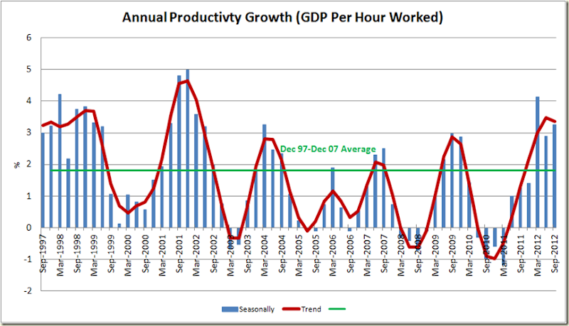
It increased in the September quarter by 0.7%, for an annual rate of 3.1% (seasonally adjusted). Needless to say, it’s along way from the 1% annual productivity growth level thrown around whenever any business leader wants to talk about the need for “flexibility”. Also don’t forget that the big drop in productivity during 2010 was due to the floods in QLD, where GDP fell but employment did not (because mines etc didn't sack staff, because they knew the mines would re-open once the water was cleared away).

But even if you ignore that we’re looking at a run of positive annual productivity growth not seen since around 2000. (But don’t worry, tomorrow the industrial disputes figures will come out and no doubt there’ll be a way to say how terrible is the Fair Work Act for the economy)

image

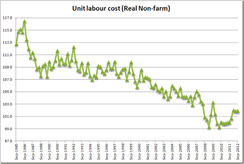
Now to labour costs. I’ll use non-farm just to be as fair as possible – because total real unit labour costs actually fell 0.7% this last quarter, whereas non-farm stayed flat:

image

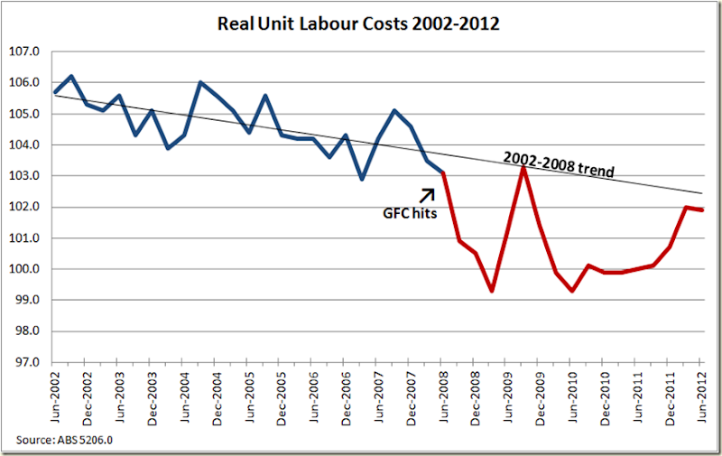
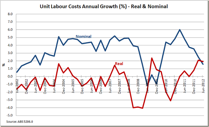
In my Drum piece a couple week’s back looking at IR legislation I noted that real unit labour costs, while they had increased of late, were still pretty much in keeping with the trend decline of the last 6 years of the Howard Government and had only increased in the past year because they had declined so abnormally during the GFC. This quarter’s figures confirm this to be the case:

image

Similarly the nominal unit labour costs continue to be low – lower than the average from 2002-2007. So the RBA certainly won’t be worrying about labour costs when considering inflationary pressures:

image

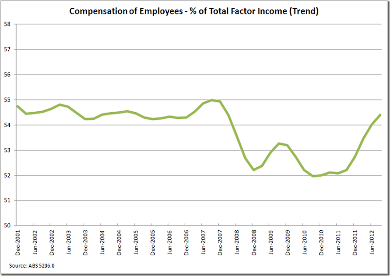
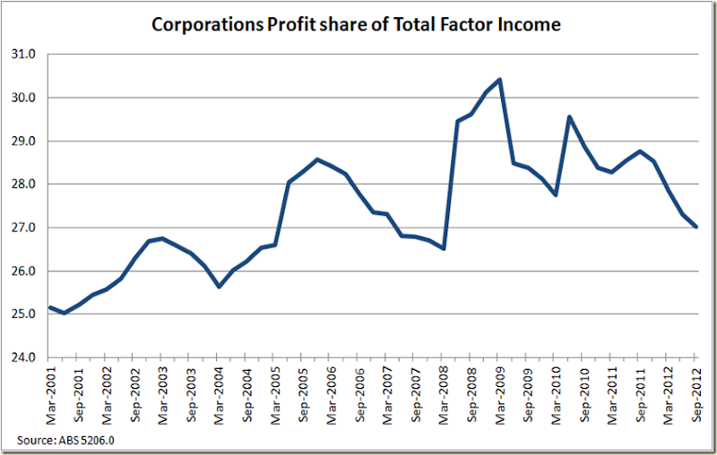
A quick look at where the national income is going shows us now back to pre-GFC ratios:

image

image

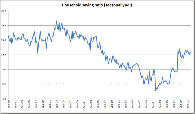
And the Household Savings Ratio stayed much the same:

image

So that’s the big picture stuff. I’ll have a bit more of a look at the data tomorrow (time permitting) – examining the states etc.

Banks: The Cash Rate and the Real Interest Rates

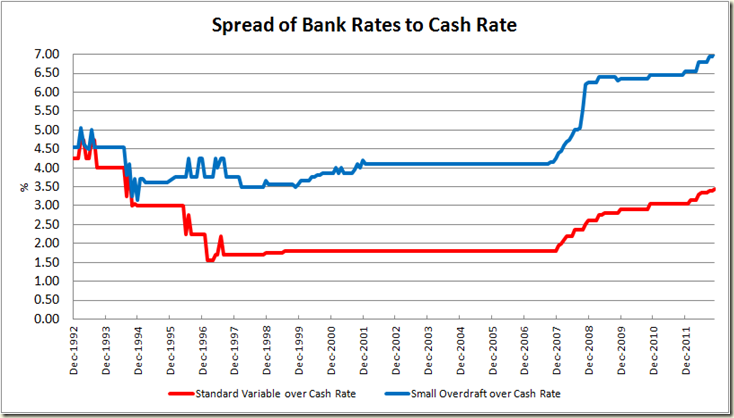
In my monthly round up of stuff to do with the RBA’s interest rate announcement I as a rule show this graph:

image

Now I must admit that by itself it is a bit misleading. It suggests the banks are making out like bandits, and are screwing mortgage holders royally.

In reality it only tells half of the story.

Today after tweeting a link to the graph, Stephen Koukoulas and Margaret Godfrey quite rightly suggested that I also graph the difference between mortgage rates and deposit rates. That’s a good idea – clearly if the spread of mortgage to deposit rates was increasing then a case could be made that banks are raising rates on mortgage holders (or lowering them by less than the cash rate is declining) while not doing the same for deposit rates. It’s also important because domestic deposits now account for over 50% of banks funding (prior to the GFC it was closer to 40%).

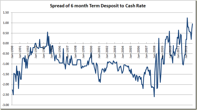
First off let’s compare the spread of 6 months term deposits to the cash rate:

image

Yes my friends, up until 2008, the rate for a 6 month term deposit was less than the cash rate. Now it is above it. This more than anything is why the first graph shows a bump from 2008 on. Prior to then, banks were laughing with respect to 40%+ of their funding. They were paying you up to 150 basis points less to hold your money than the cash rate. Sweet. But as you can see things started going a bit chaotic as the GFC neared, and then more expensive as the GFC hit. Now banks are paying around 100 basis point more than the cash rate to hold your money.

So obviously they have needed to get that extra money from somewhere….

So now let’s look at the difference between the mortgage rate and the 6 months deposit rate:

image

The current spread is 250 basis points – the average mortgage rate is 6.45%, the average 6 month term deposit is 3.95%. This spread is currently lower than the 304 basis points average for the term of the Howard Government.

Today when asked what he would do if the banks didn’t pass on the full rate of the cut, Tony Abbott pointedly refused to answer the question (because there’s bugger all he could do) but he said under Peter Costello the banks did what they were told (patent bullshit).

What has happened is that the funding mix has changed, and perhaps surprisingly the gap between what the banks are charging you to lend from them, and what we are charging them to lend from us (which is essentially what a deposit is) has shrunk of late, and at the very least is not much different to what it was when Peter Costello’s hand on the economic tiller. For Tony Abbott to say things would go back to the way they were under Howard and Costello is to suggest that actually not much would change in reality – but given the focus is almost always on mortgage holders rather than deposits (and I admit I am guilty of this as well) it’s an easy sell.

One last thing, let us look at the difference between the two rates – mortgage and deposit – and inflation:

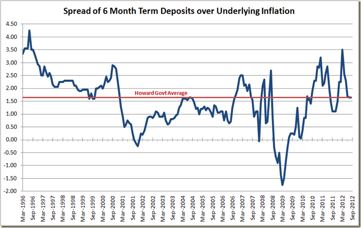
First 6 month term deposits. This gives in essence the real return on your deposit. If the bank is giving you 4% and inflation is 2% then your real return is 2%:

Well what do you know. The real rate of return is currently 1.65% – the same as the average under the Howard Government – and that average includes the now abnormally high returns left over from the high interest rates under Keating. If you look from 2000-2007 however, savers were being mightily screwed compared to now.

But it’s good to know Joe Hockey and Tony Abbott want that to return. Incidentally any self-funded retirees out there whinging about interest rates going down etc, please stop it. The past 2 years you have been doing very well. You cannot expect to always get a real return of 3.5% from just sticking your money in the bank and putting you feet up. Be realistic. 1.65% is about .5% better than you would have average over the past decade.

image

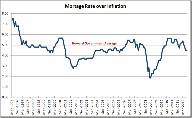
OK now to see mortgages compared to inflation. Again this looks at the real cost. If inflation is 2% and the bank charges you 7% that is a greater real cost to you than if inflation is 5% and the bank is still only charging you 7%:

image

Again we find that the real rate you are paying for your mortgage is less than the Howard Government average. Again that average includes the big rates coming down from the Keating Government, but Joe Hockey likes to cites the average mortgage rate during that time, so what’s good for the goose…

All up I think these graphs nicely show that yes life has changed sine the GFC with respect to mortgages and their relation to the cash rate, but that actually things aren’t that much different, and an argument could be made that they are better – for both borrowers and savers.

Also remember as well – the RBA knows this, and as I pointed out yesterday, if the spread of the mortgage to the cash rate was lower, then the RBA wouldn’t have needed to lower the cash rate by as much.